WordPress #8

Depending upon whom you ask, the history of the comic book business can be traced to a variety of founders. However, most comic book fanatics attribute the creation of the American comic to be associated with “The Yellow Kid in McFadden’s Flats.” Although this comic was not the first one of its kind created, it was the first to coin and use the term comic book to describe itself(Origins of the Kid 1). Before this was a multitude of closely related comic literature called “penny dreadfuls” in the United Kingdom. These were sold throughout the middle to late-nineteenth century throughout the U.K (Haining 15.) This era is often dubbed the “platinum age” by comic book historians, an era that would precede the debut and creation of the current comic books and comic book superheroes that we know today.

The history of the business as we know it today began in the late 1930s, beginning concurrently during the same time period as World War 2. Comics began to become literature that was not just tailored for a strip in a newspaper, but also instead manifested into cover-to-cover books that would contain hundreds of strips. This manifestation was made possible by the creation and publication of Superman by Jerry Siegal and Joe Schuster through what is now known as Detective Comics (DC.) The co-creators of Superman would then usher in a new era, called the golden era, where many of the most recognizable comic book heroes were created (Goulart 43). Wonder woman, Batman, Captain Marvel, and Superman were all recognizable comic book characters that became staples in many of the adolescent teen market that comic books geared to. The marketing strategy and material of comic books were geared to those age eight to thirteen. Originally, the image of the superhero was to protect the ordinary vigilante and citizen from real world dangers, such as fires, pickpockets, and street thieves. However, once superheroes began to move on to more treacherous villains, such as Hitler, the idea of a superheroes role changed. The superhero could not just fight pickpockets anymore; comic book writers had to introduce new and more treacherous villains, such as the Joker, Lex Luther, etc. (Secret Origin).

The golden age of comics also crafted my favorite superhero, Wonder Woman. I think so because she was the first representation of a character in comic books that symbolized a cultural change in America. World War 2 gave birth to a wave of feminism that showcased the abilities of women beyond the framework of the household (Crawford 1-2). Followers of the series were refreshed to see that the usual depiction of the damsel in distress had become a protector of man. Readers became disappointed when writers and story developers began to take wonder women into a more “traditional” role; one that shopped, cleaned, and gawked over guys. The negative backlash and drop in subscribers/readers became a clear indication to the writers at DC that Wonder Women was enjoyed because of her ability to transcend the stereotypical concepts of gender roles (Secret Origin). Comic books, which are targeted toward a younger audience, began to create and guide new ways of thinking in youth.

Crawford, Phillip C. “The Legacy of Wonder Woman.” Home. 1 Mar. 2007. Web. 9 Apr. 2012. <http://www.schoollibraryjournal.com/article/CA6417196.html&gt;.

Goulart, Ron. Comic Book Culture: An Illustrated History. Portland, Or.: Collectors, 2000. Print.

Haining, Peter. The Penny Dreadful: Or, Strange, Horrid & Sensational Tales! London: V. Gollancz, 1975. Print.

“Origins of the Kid: Contemporary Illustrations.” American Studies @ The University of Virginia. Web. 9 Apr. 2012.

Secret Origin: The Story of DC Comics. Dir. Mac Carter. Perf. Ryan Reynolds. Warner Bros. Pictures, 2010. DVD.

WordPress #7

The Piano, directed by Jane Campion, and the 1995 BBC produced version of Pride and Prejudice are both romantic dramas that are set in the 19th century. However, there are vast differences in the way the directors decided to portray each story in terms of representing information, either through dialogue or through strong use of visual imagery. The story of Pride and Prejudice relies heavily on the usage of open dialogue between different characters. Contrastingly, The Piano often relies on the use of strong visuals such as symbolism, imagery, and dramatic emotions portrayed by the actors since the protagonist Ada is a mute character that does not speak once throughout the film.

Western cultures in general are very low contextual. This means that they often do not take signals from a situation and instead rely heavily on direct conversation and dialogue in order to interpret a situation. This is definitely seen in Pride and Prejudice. It seems that all information is revealed to the viewer through direct conversation with no subtlety. This contradicts many stereotypes that many people associate with the Victorian era. The era is usually historically associated with closure and hiding your feelings. However, the romance and hate that bounces back and forth between multiple characters, including Elizabeth Benton and Mr. Darcy is often presented in a very blunt manner.

The characters are often outright vicious in many scenes, such as the Darcy family showing their pride over the Bennet family by talking about how low they are on the social scale. Lizzie even confronts Darcy during a formal dance if his “judgments are ever clouded by prejudice.” This quote is referring to his feelings on interacting with people from a lower social class. This conversation takes place during the middle of a ballroom dance, a time where it is often unusual to ask directly something so bluntly. It is as if the characters have no filter in expressing their opinions. This is also shown in the discussion that happens at another formal party, when the Bennets begin to discuss how Elizabeth should marry William Collins for his marry, even though everybody is able to overhear.

Nothing is kept inside of ones self, which detracts from the visual imagery in having an effect. The visuals of Pride and Prejudice more reflect the time period rather than the feelings of the character. Much of the focus and attention seemed to be put on the costume design and set design rather than symbolic visual elements since much of the dialog speaks for itself.

This is in contrast to The Piano, a movie that uses a heavy amount of visuals to tell the story rather than dialogue. Although the viewer is able to hear the thoughts of Ada through her daughters interpretations, the Piano relies heavily more on visuals, such as facial expressions in order to carry the films dialog since Ada is mute. Naturally, since the protagonist of The Piano is a mute, their is a further challenge for the actress to portray the thoughts and inner workings of the character, rather than those in Pride and Prejudice, since they have no problem outwardly expressing them through dialogue. The director and screenwriter were able to capture these thoughts through the use of music, symbolism, imagery, and expressions. The music often sets the tone, as that is one of the most practical ways that Ada can express herself. She plays a somber melody that has a hopeless tone under grey skies on a dreary beach when her and her daughter are first dropped and abandoned on the New Zealand beach awaiting for Mr. Alaister Stewart. Although Ada is mute, her ability to express emotions throughout the film is not lost because of the director’s great use of visuals.

Ada is able to express uncomfortableness and pain even without the ability to talk. For example, when she is placed in the unfamiliar jungle setting surrounded by the Maori people her and her child are surrounded by cool tones, . Her uncomfortableness is only further shown when the rain is pouring over her and her new husband’s faces while they get their wedding picture taken. The director repeatedly uses cooler tones and rain in order to represent the sorrow and depression of Ada. Naturally, warmer tones are associated with happier moments in the film. This is best exemplified in the scene where Ada is first reunited with her piano; a scene that uses joyful music, warm tones, and smiles on both Flora and Ada’s faces in order to translate the happiness in Ada. The Piano overall is able to use more of visual symbolization, such as tones, in order to further the story unlike Pride and Prejudice.

Pride and Prejudice. BBC Worldwide Ltd, 1995. DVD.

The Piano. Dir. Jane Campion. Miramax Films, 1993. DVD.


WordPress #6

The dragon, as a cultural staple in China, has been omnipresent in their lives since the early ages of “The Empire of the Rising Sun.” Although there is no specific date that pinpoints the use of the dragon, it can be seen that even as early as 3000 BC people used the mythological creature in order to symbolize the qualities of happiness, immortality, procreation, fertility and activity(Chinese Dragon 1). The dragons as a symbol transcended socio-economic classes and prestige, they were a creature that were highly revered and respected by many Chinese citizens, whether they were poor, rich, or emperors. The Chinese view the dragon as a divine creature, one that has grace and beauty with its length and immense power(Chinese Dragon 1-2).

Westernized Dragon

Chinese Dragon

As seen by the two contrasting images, the depictions of the dragon can vary greatly from culture to culture. A symbol of power, beauty, and grace can be viewed as a symbol of destruction, force, and brutality in another. The dragon in the Chinese culture, as mentioned before, is representative of a divine beauty that graces the sky and nature. Its length covers the length of the sky and lakes and can be seen as a protective creature over the Chinese. However, the mythical creatures of dragons in Western/Europeanized cultures such as America have long represented destruction and terror(Symbolism in Asian Art 1). The Chinese people are able to interact and go on with society under the presence of a dragon, in fact they long for the presence of a dragon. However, Americans and other westerners cannot coexist with the idea of a dragon; they simply do not align the same traits to the dragon as the Chinese culture does.

There is not just one kind of dragon in the Chinese culture though. Different dragons are representative of different values, traditions, history, and various other facets of Chinese culture. In total, there are classically nine distinct dragon types that are represented in Chinese culture. You have certain dragons, such as the Earth dragon that presides over the lakes, rivers, and bodies of water that are found in China. This Earth dragon serves to grant a great fertile season for the many agricultural workers in China, who make up a great amount of the labor workforce in China. You also have other dragons that preside over the heavens and spirits such as the Celestial Dragon and the Spiritual Dragon. Dragons are more than just a one-dimensional evil character in the Chinese culture. Each dragon has a distinct function and personality that helps contribute to the balance of Chinese life(Asian Dragons 1-3).

The prominence of the dragon as a cultural symbol is not only expressed in the words of the Chinese. The importance of this symbolic creature is also expressed outwardly in the setting of modern day Chinese festivities and celebrations.One specifically that can be pointed out is the Chinese Dragon Boat Festival, one of the festivals in Chinese culture that have the longest history, dating back to 277 B.C(Fang and Gordezsky 1). With the celebration of the Chinese New Year is also the usage of the dragon as a symbol. The dragon represents strength and luck, two qualities that the Chinese value. Also, the dragon is used as a symbol to represent the whole year. As a symbol of the Chinese zodiac the dragon is used as a year that will bring many good fortunes, luck, and strength to the Chinese people(Year of the Dragon 1).

“Asian, Oriental Dragons.” Chinese, Oriental Dragons. Web. 06 Mar. 2012.

<http://dragonsinn.net/east-2.htm&gt;.

“Chinese Dragon.” Chinese Dragon. Web. 06 Mar. 2012.

<http://www.beijingservice.com/beijinghighlights/chinesedragon.htm&gt;.

“Symbolism in Asian Art.” Asian Art Mall. Web. 06 Mar. 2012.

<http://www.asianartmall.com/AsianSymbolism.html&gt;.

“Year of the Dragon – Chinese Zodiac Dragon.” Chinese Zodiac. Web. 06 Mar. 2012.

<http://www.chinesezodiac.com/dragon.php&gt;.

WordPress #5

The Newseum, unlike many other museums, holds a balance between past and present. Although the Newseum presents media from the past, it is not too removed from present day society. For all ages there is something represented from our past memories to present day that can evoke an emotion within us. These feelings are stimulated in the museum by some sort of visual, whether it is a video, audio piece, picture, or artifact.

Being from New York, I was particularly moved and affected by the 9/11 exhibit which depicted a multitude of newspaper covers, from both international and domestic areas, with headlines and photos of the incident. This exhibit is a recent global news piece that was heard around the world, and the way that the media presented the visuals was strong(“Newseum 9/11 Gallery” 1). The clear abundance of international and national headlines showcases the clear importance that this event had in America and in other nations all around the world.

This particular exhibit also combines the melding of using artifact, visual information through photography, audio, videos, and textual information in a manner that conveys the story in a way that can transplant you from that moment in time to that day in New York City. Above you can see a picture of this exhibit, a combination of the antenna of the world trade center as well as the hundred or so newspaper covers that show the significance of this tragedy. The lining of this huge wall with these covers draws the eye to the dramatically high ceilings, which gives a staggering effect of importance.

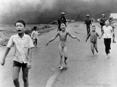
Also, one particular photograph that stood out to me was of Pham Thi Kim Phuc crying down the Vietnamese street, shot by Nick Uts. There is such a sharp contrast between the screaming and distraught children and the American military soldiers who are casually standing in the background without any emotions visible(Krause 118). This particular image stood out because of my previous critique on the Kent State shooting photograph, which also won the Pulitzer photo. Given that this war, the Vietnam War, produced so many emotion evoking photos truly captures how tremendous the event was in American history and how it affected the population in the 1970s.

The subject of the photo, Pham Thi Kim Phuc, is stripped of not only her clothing, but also of her happiness. The photo is a great visual representation that gave face to the people that were being affected by this tragic war(“Picture Power” 1-2). This face is emphasized even more by the framing of the naked screaming girl in between the soldiers standing in the background of the road. This framing engages the eye to first be drawn into the girl, but then slowly and subtly start to realize the tragic situation that is unfolding around her(Krause 90).  The photographer was relentless in capturing the true brutality that was being drawn on not the government officials, but the regular everyday civilians, including young and innocent children; in this photograph, there is no doubt that Mr. Uts succeeded in portraying the truly horrific conditions and brutality that they had to endure.

News is supposed to stir some kind of emotion, whether it is excitement, sorrow, anguish, disappointment, etc. The presentation of the 9/11 exhibit, as well as many others such as the Pulitzer Prize photographs gallery, Berlin Wall exhibit, and First Amendment gallery stir emotions within us all in some way. Some may have difficulty in other museums pointing out the cultural and historical relevance that exhibits have on us today, but in the Newseum it is apparent that the exhibits they show are truly the most eventful news stories that shaped the world and our minds.

Krause, Jim. Photo Idea Index. Cincinnati, OH: HOW, 2005. Print.

“Newseum 9/11 Gallery.” Newseum. Comcast. Web. 27 Feb. 2012. <http://www.newseum.org/exhibits-and-theaters/permanent-exhibits/9-11/&gt;.

“Picture Power: Vietnam Napalm Attack.” BBC News – Home.

Web. 15 Feb. 2012. <http://news.bbc.co.uk&gt;

WordPress #3

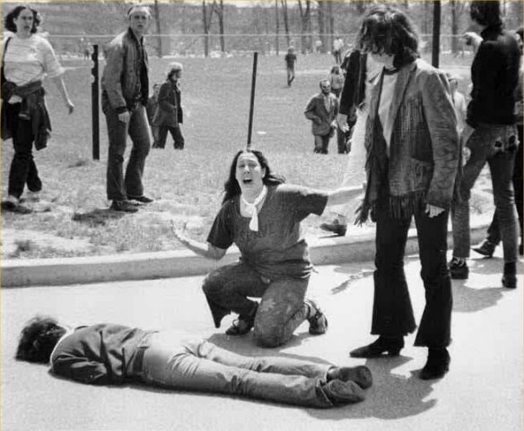
Historically speaking, photography has, for close to a century, pushed the boundaries of capturing moments of great significance, including the Kent State massacre. The Kent State massacre happened on May 4, 1970, during the middle of the Vietnam War. A peaceful protest gone wrong, the Kent State massacre was an act of police brutality that ended up serving as a moment in time that would be forever be remembered as one of the key turning points of disapproval over the Vietnam War(Thomas and Hensley 1-2).

During this period of time image capturing tools were given unprecedented access to battlefields, cities, and areas that were devastated by the results of war, conflict, and violence (Teaching With Photographs 1-2). Like the rest of the country, photography was experiencing a revolution in which every painful reality, no matter how grotesque and unsettling it may be, was captured and published for the general public’s viewing. This documentation of horrors related to war could be seen in photos that extend beyond the Kent State massacre; such photos include Nick Ut’s photograph of 9-year-old Phan Thj Kim Phuc running the streets of Vietnam naked and Eddie Adam’s photograph of Nguyễn Văn Lém being executed(Picture Power 1-2). The Kent State massacre photo represents photography being used as an outlet to capture the horrors that might have previously been glanced over under and repressed in generations of the past.

In regards to the photo itself, the photo represents a wonderful snapshot of the desperation, anger, and frustration that was present at the time of the Vietnam War. You have an obviously pained and sorrowed woman framed in the center of the photo over a corpse. The framing of the angered woman with the confused, and almost indifferent, onlookers standing to the side of the corpse creates a dramatic story of the protest and captures the intense emotion of the woman to the audience (Krause 90).

Like the contrast of the indifferent people and the horrified woman, the photograph also highlights traditional American cultural values, such as the embracing of the freedom of speech and assembly by presenting the absence of it. The irony of this photo, and perhaps one of the most tragic aspects of it, is that the heinous massacre was not done by foreign terrorists or criminals, but by the very own police enforcement of America(Hensley and Thomas 1-3). This can explain some of the emotion and tragedy that is portrayed by the shrieking woman.

Krause, Jim. Photo Idea Index. Cincinnati, OH: HOW, 2005. Print.

Hensley, Thomas and Jerry Lewis. “THE MAY 4 SHOOTINGS AT KENT

STATE UNIVERSITY: THE SEARCH FOR HISTORICAL ACCURACY.”

Kent State University Departmental Site. Kent State University.

Web. 15 Feb. 2012.

“Picture Power: Vietnam Napalm Attack.” BBC News – Home.

Web. 15 Feb. 2012. <http://news.bbc.co.uk&gt;

 Teaching With Documents:
The War in Vietnam – 
A Story in

Photographs” National Archives and Records Administration.

Web. 15 Feb. 2012. <http://www.archives.gov/education/

lessons/vietnamphotos/>.

Visual Literacy Advertisement

The photograph and advertisement that we created this week focuses on the skateboard accessory “slide gloves”. It is a lesser-known accessory to people that don’t skate and even to people that do skate. However, the point of advertising is to effectively bring attention to a product in order to get customers to purchase it. With our advertisement we used various research done on skateboarding and skateboarding accessories as well as photographic and design techniques to make our advertisement as affective as possible.

Our brand targets male teens and young adults as seen by various skateboarding brand advertisements associated with companies such as Element, Volcrom, and Flip(Element). These skate boarding and skate boarding apparel companies heavily feature athletic teen males as the animate subject in order to persuade other male teens to buy their products. Although the female population of skateboarding is growing, advertisers note that only 15% of the skateboarding population is comprised of the female gender, making it reach more of their audience if they feature male teens (Skateboard Statistics, 2). Advertisers in the skateboarding industry also note that 1 in 7 youth are skateboarders, meaning that out of the 13-million skateboarders in the U.S., 93.7% were younger than 24 (Skateboard Statistics, 1). Clearly, a heavy majority of these skateboarders are young male teens/younger adults who enjoy the sport. With that being said, it only made sense for our advertisement to feature a young male in order to reach the concentrated population of the skateboard community.

However, just because females compromise a minority in the skateboarding/skateboard apparel industry does not mean that advertisers should not feature them as well(Skateboard Statistics 2) . Reports state that skateboarding is one of the fastest growing sports among females today, allowing for many brands and companies to have new market opportunities. Advertisers who include females in their advertisements in marketing skate products will be able to take up a new untapped part of the buying population that they may have previously not targeted.

We believed in creating an advertisement for the skating accessory of a slide glove since skateboarding has become a staple and hobby for many young teenagers today. Skateboarding and the skateboard has become a sort of pop-culture staple in today’s society, similar to the pogo stick and hula hoop in the past. We felt that skateboarding accessories, like the slide glove, could be effectively advertised for since as stated before 1/7 youth owns a skateboard. By bringing attention to an accessory you can target buyers that already own a skateboard and new customers that may want to give skateboarding a try. With that being said the photograph we used was a shot that used motion, continuous shoots, font techniques, and colour to attract buyers.

The shot is captioned with black and white font, colours that are enough to catch the targets eye but not give the advertisement more chaos and confusion that is not needed. In this case, the simplicity of the font and its colour aids the audience in reading and figuring out the purpose of the product rather than distracts the audience because of a terrible font. The slogan is coloured differently than the actual product in order for the audience to notice the difference between the slogan and the product (Williams 186-187). The product, highlighted in white rather than black, becomes something the audience distinctly remembers. We also paired the white font highlighted product “Sliding Gloves” with a curvy font. This felt appropriate for the shot since so much action and motion is conveyed in the photograph where that it would only make sense to continue keeping that motion with the way the font was presented, allowing for the direction of the sliding to also be presented in the font type (Williams 182).

This motion of the photograph pulls the reader into the action of skateboarding and sliding instead of just presenting a photograph of a skateboard. The photograph, taken with continuous shooting, allows for the motion and action of sliding and skateboarding to be realistically presented. The editing and splicing of three photographs together creates more motion than if a non-continuous type of shooting was used (Krause 166).

The colours of both the gloves and skateboard pop also help create a contrast that draws in the audience. The colours of the sliding gloves and skateboard pop out against the more cool colours of the street and grass while the subject skates, allowing the audience to focus more on the gloves and skateboard which helps drive the photograph. (Krause 106-108) The neon and vibrant red found on the gloves and skateboard is the right mixture of being visually stimulating to the audience without being too overbearing and distracting.

Overall our project combines vibrant colours, motion, and font styles in order to bring in and retain the attention of the key targeted demographic, young adult/teen males. Photo and design aspects such as continuous shooting, colour schemes, and font design helped us produce an advertisement that we believe effectively entices the market to

ElementUnitedStates.com. Element, website, website. Jan. 31, 2012.

Krause, Jim. “Photo Idea Index.” Cincinnati, Ohio: How Books, 2005. Book.

Skateboard” Stastics” lakesidepark.com. Lakeside Skatepark Committee,

website. Jan. 31, 2012.

Williams, Robin. “The Non-Designer’s Design Book.” Berkeley, California: Peachpit

Press, 2008. Book.

Visual Literary Response 1

ImageThis photo is set in the Terrace Dining Room(TDR) cafeteria located on the American University campus. It was inspired by seeing people repeatedly set plates full of food off to be thrown out and cleaned. After seeing so many people do this I sought to take a photo of it being done. What I first thought of was the perspective and angle at which the photo was taken. At a full on frontal angle I felt like the food was not captured well as well as the back room that they were being sent to. At the side angle that I took it at the photo emphasized the plates of food at the front seen going into a room towards the back of the photo (Krause 19, 32). On that day the fact that broccoli was being served helped add a vibrant green to the photo, allowing for the food to pop out even more against the metallic and cooler tones of the photo (Williams 103).

The wasted food and broccoli, which is the point of the photo, pop out because of the saturation of the vibrant green combined with the angled perspective that puts the plates of food at the front of the photo, leading your eyes. Some problems I ran into with the photo is the setting being a crowded place with heavy human traffic.  I didn’t want to stage the shot, as it would defeat the theme/purpose that I was getting at. However, every second it seemed like some one would get in the way of the shot or the photo I was trying to take, only complicating matters. To deal with this I only had a very short amount of time to take a set of photos before some one would obstruct the shot and get in the way. I had difficulty in showcasing the people in the context of the situation as well as showcasing the food at the same time, so I opted out of including a human subject in this photograph (Krause 136-139).

This is the first photography based class I have ever taken as well as the first time I’ve ever worked with a camera with the intentions of it having some artistic value.  With the class I hope to gain some fun experiences in capturing visuals and exploring it in a more artistic manner.